

After:


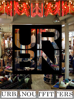 The poster I made uses different aspects of the picture I took outside of Urban Outfitters, such as; the boxes at the bottom (I warped them to change the perspective), the ribbons draped from the top, and the complete picture I took was used in the word URBAN along with a picture of a city skyline I found on Google. The main picture was a picture of the inside of the store.
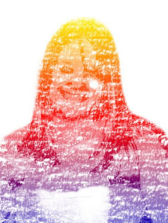
 For this project we were given the freedom to choose whatever we wanted to do on Photoshop and create a project of our choice. My favorite Photoshop skill is making collages. So I combined my interest in fashion with my interest in collages. I took different prints and used them as backgrounds and I also created borders around the manequins. Also, I found a dress form online, but I used material that I found and layered it on top of the dress form. Then I thought of the first thing that came to mind when I saw the picture. In the first picture I thought the outfit looked more edgy, so to accentuate that I chose bright red lips and put them with the outfit. I thought the second outfit to be more proper so pearls seemed to fit.
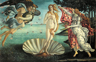
  In this project we had to find a picture done by famous photographer Jerry Ulsemann and replicate it. What makes his work special is the way he makes the pictures. Ulsemann takes pictures using a photography camera and in the dark room he edits the pictures together, creating the illusion of surrealism. So instead of using a dark room to combine my images I used my skills with Photoshop to give the same effect.
 To make this project we had to take multiple pictures of the same scene handmade from clay that we formed into a rocketship, aliens, a spaceman, and a planet. However, after every picture we took, we had to move our characters to give them the effect of being a movie once we put all the pictures that were taken (214) together, in order and added music, transitions, a title and credits.

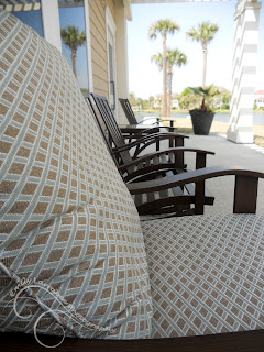
To the first picture, I set it onto another project with a white background and used lasso tools and stamp tools to give the lines the effect of dragging out past the original picture. However, to keep the photo from looking overdone, I only extended a few lines.

For the second picture I edited, I used a picture that represented perspective and cut and pasted the section of the photo that had the perspective and drug it out to make it stand out and seem larger.
 Animal/Pet
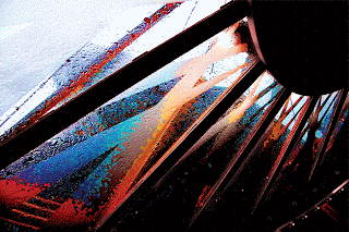 Artistic
 Night
Night People
And now for my take on five different types of photography! The first I did was sports instead of portrait. This picture was taken at my brother's hockey tournament in Washington D.C. I then edited it in camera raw to make it more realistic and more vibrant.
 The second picture I took and edited was during the night. I took a picture of a lantern on the wall in my kitchen while it was illuminated. Then I altered the settings only a little bit to make it stand out a little better.
 Next, I did a picture that was in black and white. Originally the picture was taken in color, but in Adobe Camera Raw I changed it to be black and white because I thought that setting looked best with the specific picture.
 For my fourth picture that I did, I chose to do something artistic. So, I took a picture of the stove in my kitchen, and to make it a little more bright, I turned on the gas so that you could see the bright flame. Then, in Adobe Camera Raw, I turned up the vibrancy and saturation so that all the reds and oranges were brighter.


